In-house
Branding
2018-2023
Overview
Info
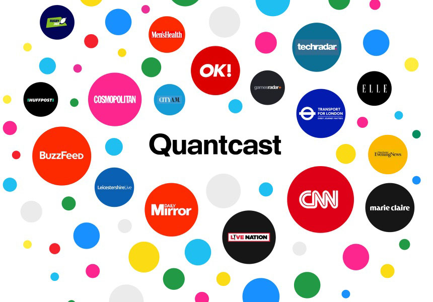
I maintained the Quantcast brand system, ensuring brand uniformity across products, websites, and collateral by harmonizing elements like logos and color schemes. By fostering collaboration with product design, I maintained a unified brand identity, adjusting it to meet the changing demands of the digital landscape.
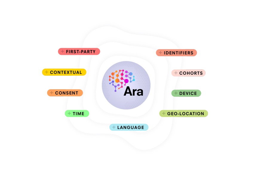
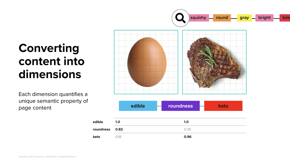
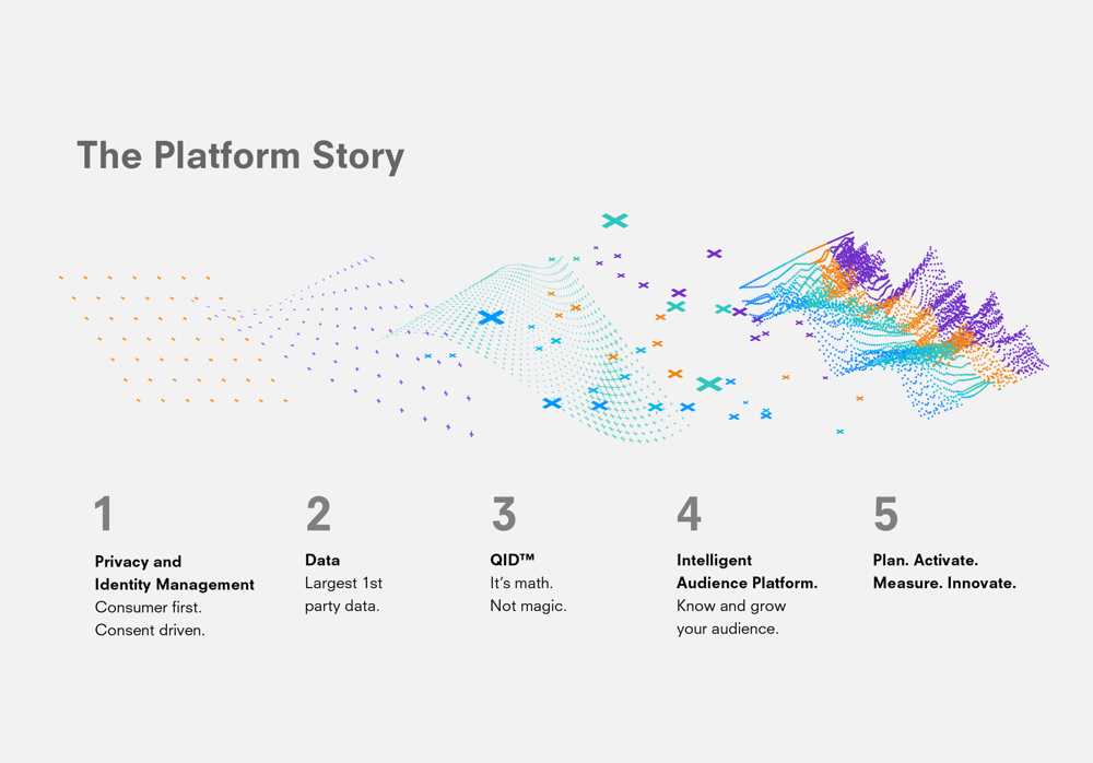
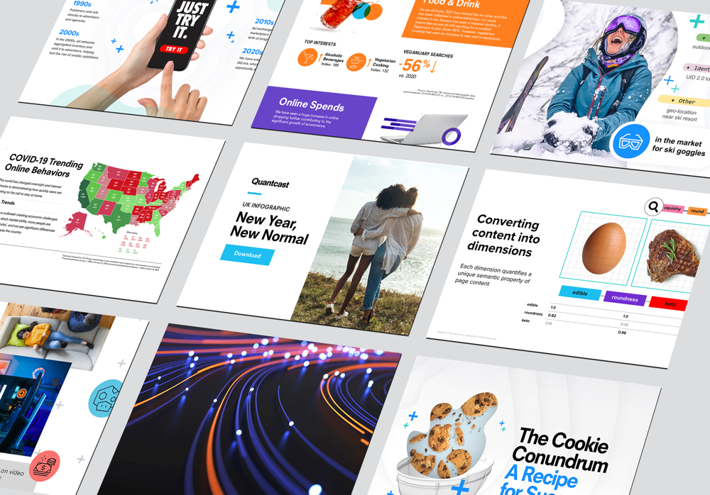
While its visual appearance underwent significant evolution, certain key elements endured, including bold Swiss typography, a structured grid system emblematic of the science and data behind our products, and a dedicated focus on making data and insights more accessible by emphasizing critical information for easier comprehension.

I moved onto the Marketing Design team right after an agency rebrand. Our job was to implement the new brand and messaging.
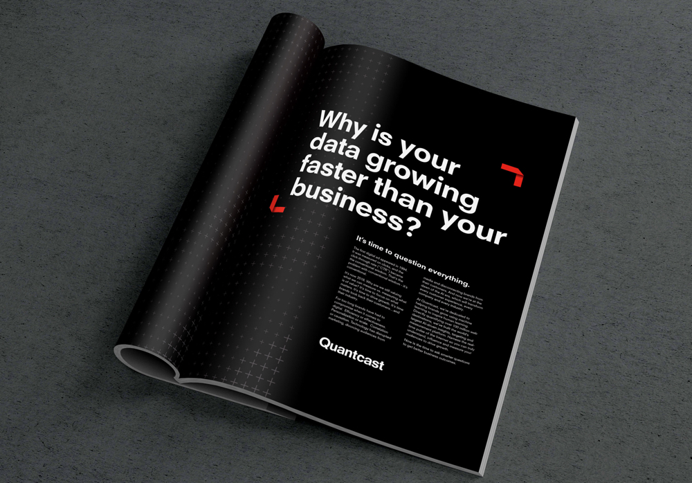
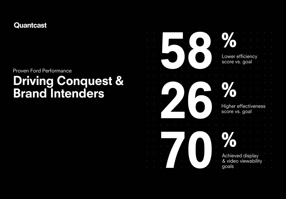
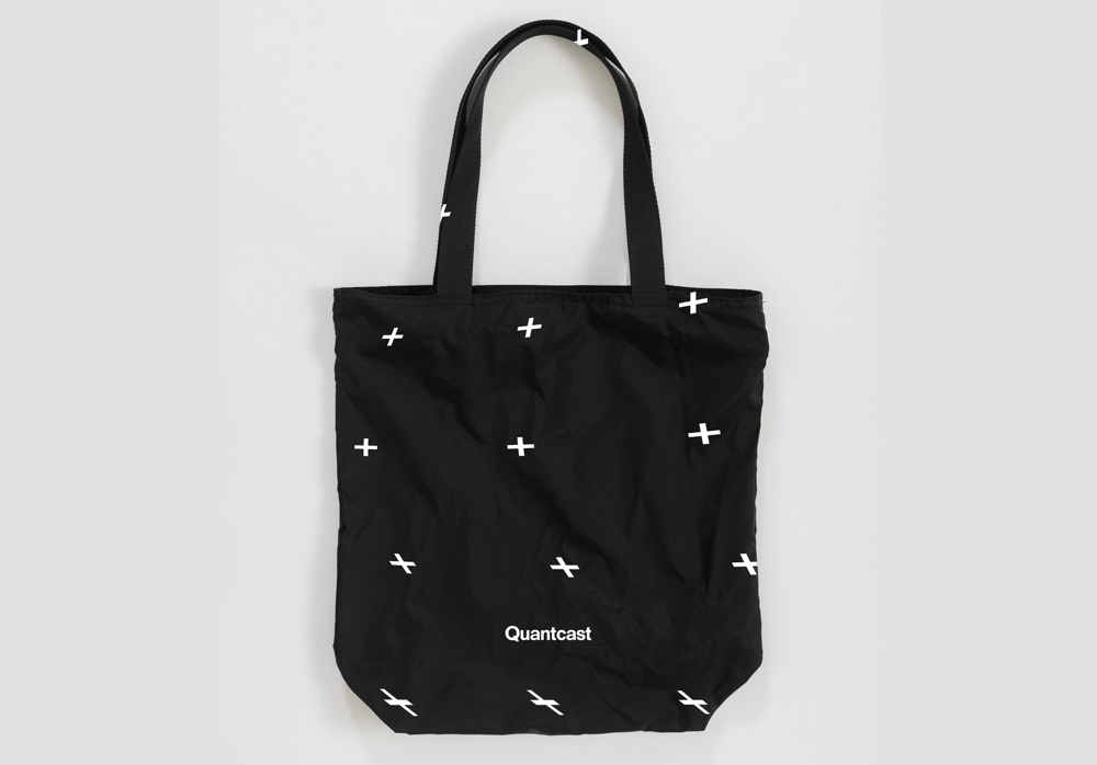
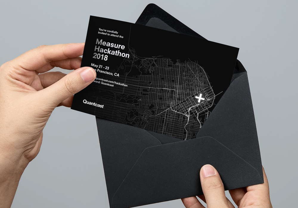
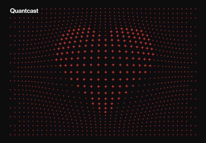
Following the departure of our Chief Marketing Officer and Creative Director, my two fellow designers and I recognized that we had become the final decision-makers for all matters related to brand design.
In response, I took on the role of leading the design team, with a focus on achieving specific objectives. These included achieving a more harmonious balance in our visual elements, particularly by introducing lighter layouts, which also served to counter the metaphor of the "black box" associated with AI decision-making. Additionally, I aimed to strengthen the synergy between product design and marketing design.
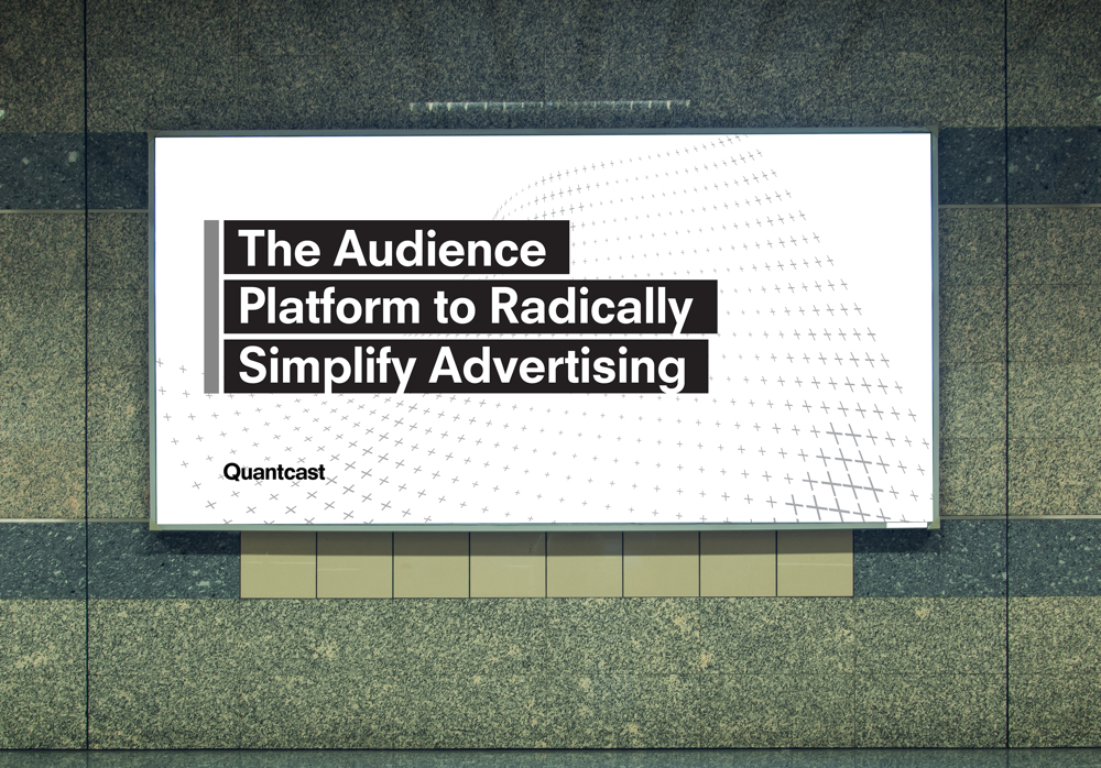

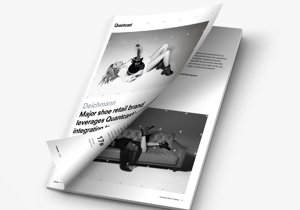
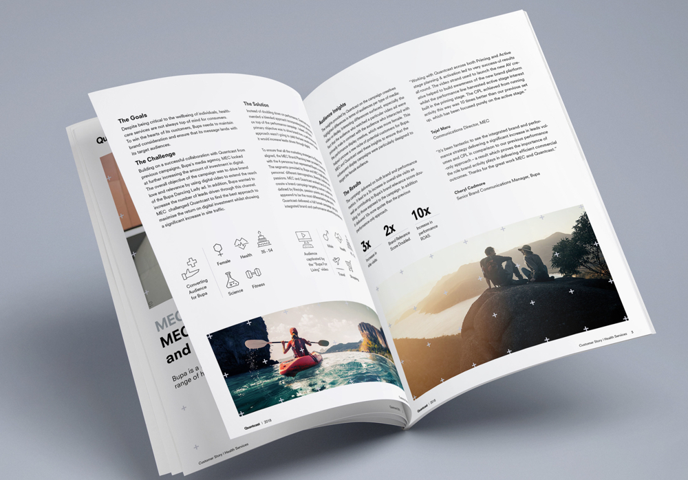
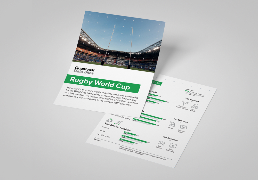
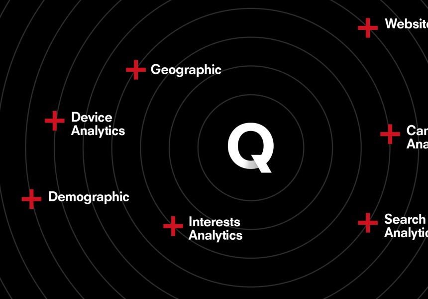
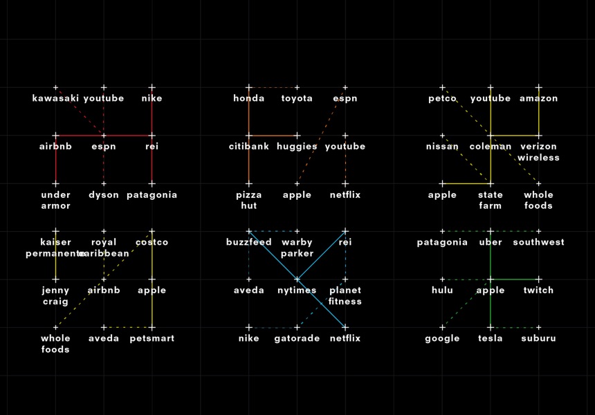
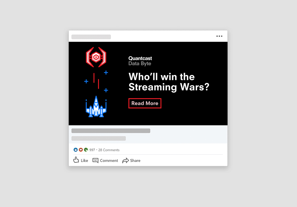
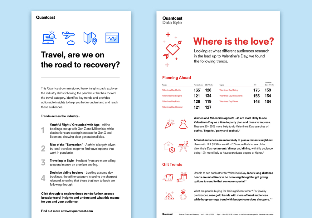
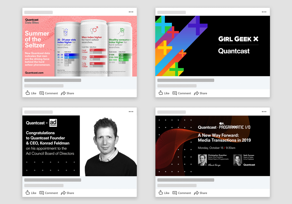
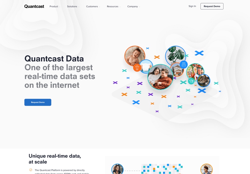
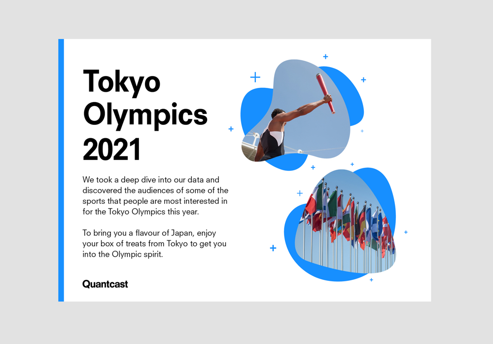
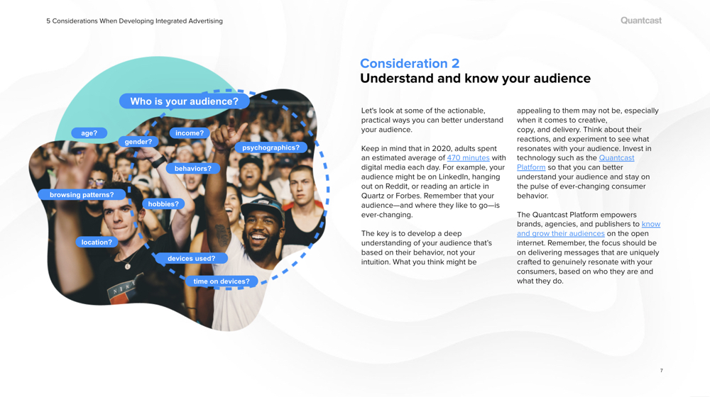
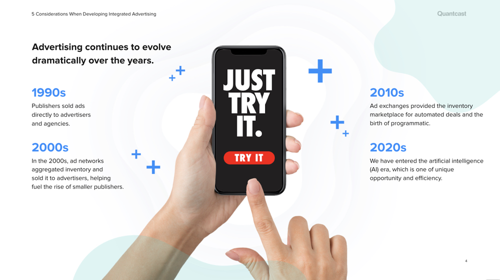
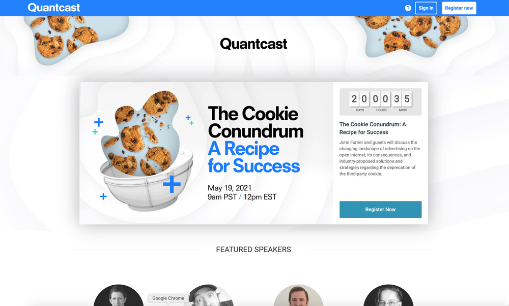
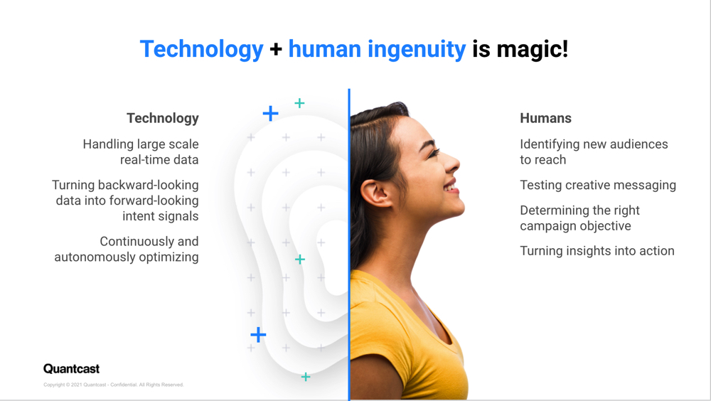
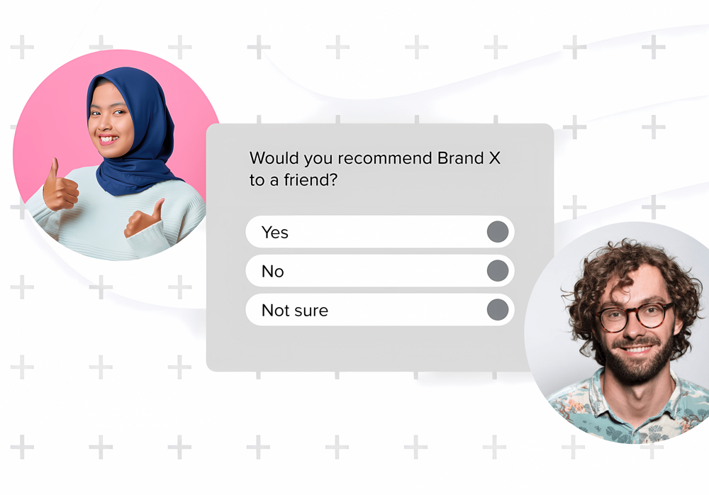
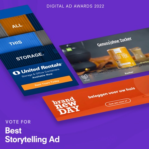
A new CMO wanted a brand refresh, which we completed interally in 4 months. This coincided with a live-streamed announcement of the self-serve platform launch and a big update to our website. We found more use cases for our underused color palette, introduced more human-centric photography (instead of vague data patterns), and introduced new shape-oriented background visuals.

