K-12 Educational
Lesson Covers
2014-2016
Overview
Info
Team: Product Manager, Freelance Designers, Lesson Writers
Role: Designer
As the lead designer for digital educational lessons, I spearheaded the creation of visually appealing and effective covers. A significant achievement was implementing a rule-based design system tailored to different subjects, ensuring consistency and coherence across the entire collection.
Additionally, I successfully managed a team of freelancers, guiding their work and developing templates adhering to our design standards. Recognizing the importance of engaging students of varying age groups, I devised a dynamic character system tailored to K-12 learners, capturing their attention and enhancing the learning experience. My efforts aimed to make covers visually compelling while aligning with educational objectives, contributing to the overall success and impact of the digital educational lessons.
On the Website
Selected Covers
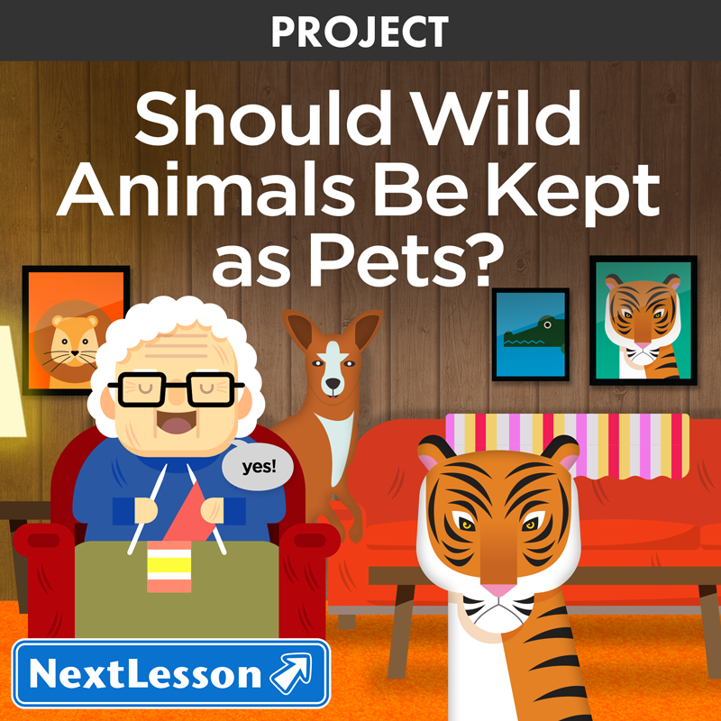
Should Wild Animals Be Kept As Pets

Crowd Control

Need for Speed
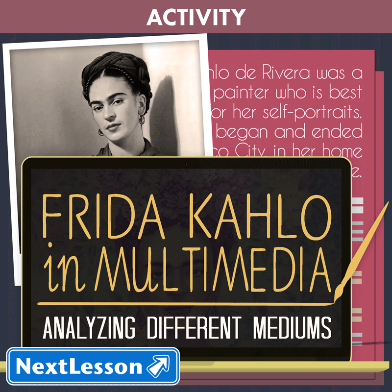
Frida Kahlo In Multimedia
Bundles of Fun
Put Me In Coach
Probability Possibilities

Driverless Cars

Blockbuster Blowout

Box Office Bonanza
Compound Word Wiz

Holly Jolly Trig

Build a Lunar Lander

Golden Gaming
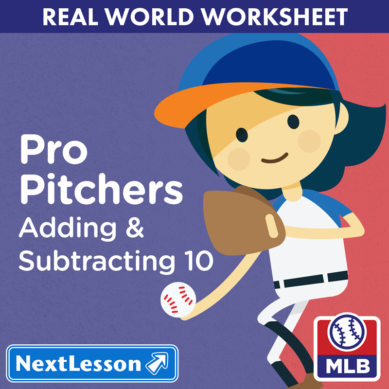
Pro Pitchers
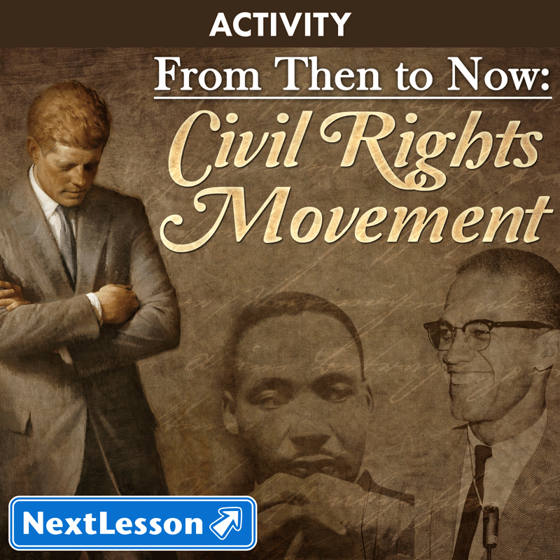
From Then To Now Civil Rights Movement
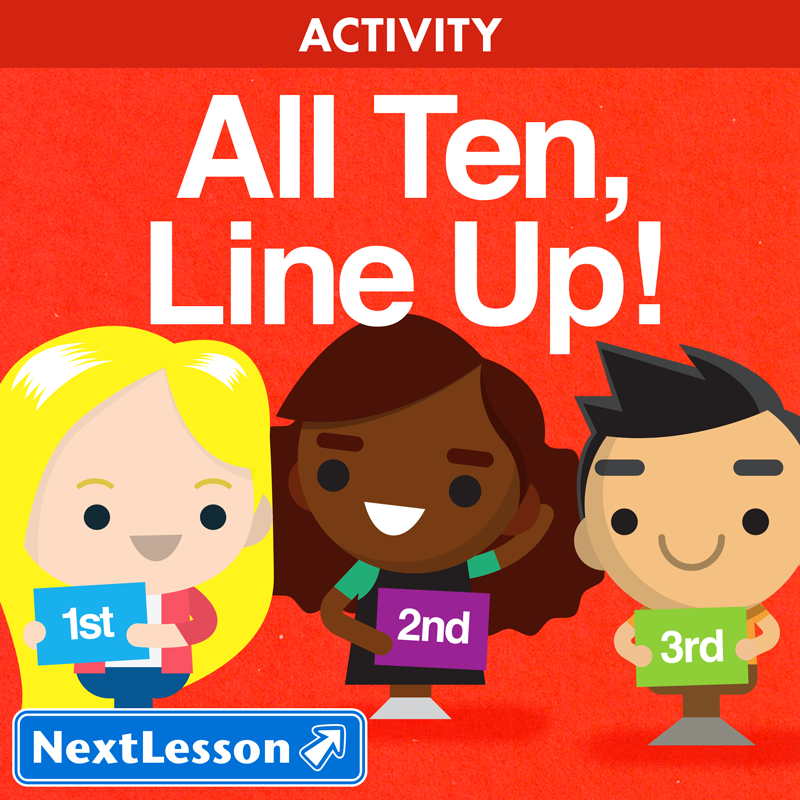
All Ten Line Up
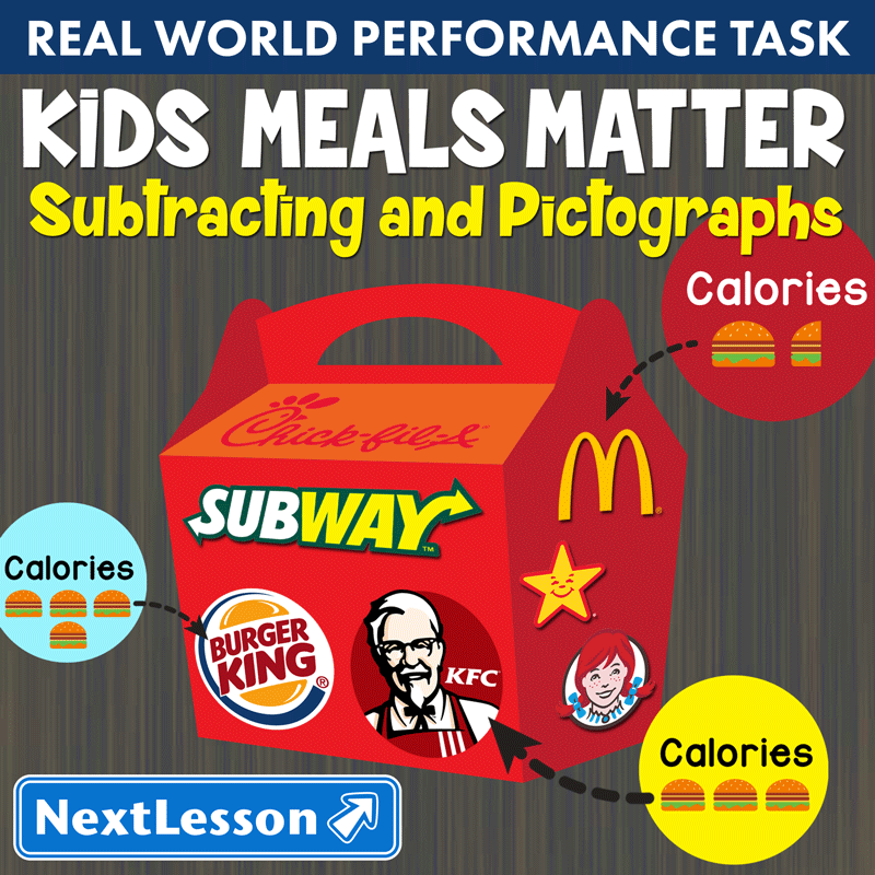
Kids Meals Matter
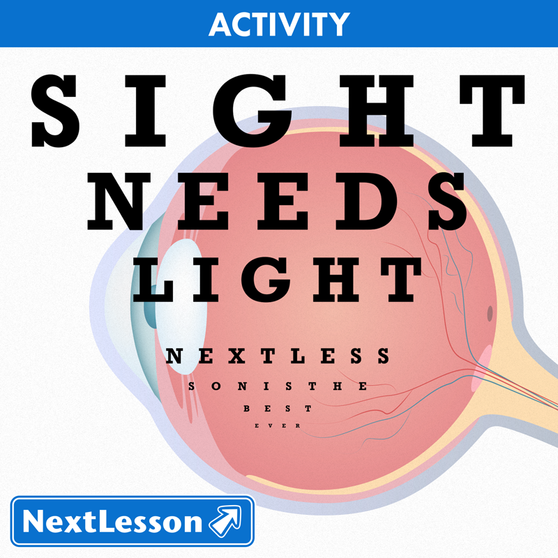
Sight Needs Light
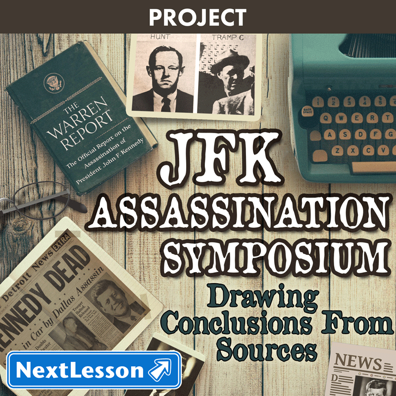
JFK Assassination Symposium

Solar Power

App-tastic 4

It S Party Time

on the Go

Intergalactic Tourism
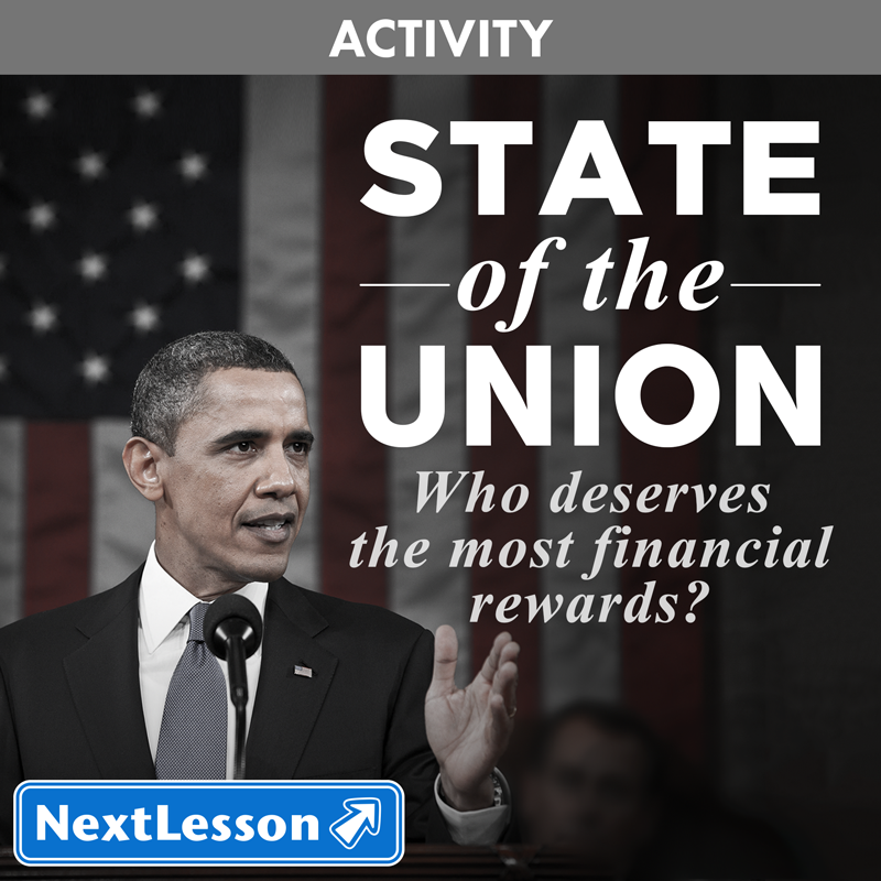
State of the Union

Genre Knowledge

Movie Popularity
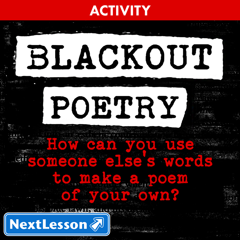
Blackout Poetry

Time To Fly

Funding Space Exploration

the Election

Amazon Excursion

Mmm Mmm Bakery

Arguing for Continental Drift