Customer
Product
October
2016
Overview
Creating a fun tool where students rate topics to build educational content around topics that students are interested in.
Info
Team: Product Manager, Engineer
Role: Visual Designer, Illustrator
Timeline: 6 months
Wifreframes
Process
Icon development. In addition to building the tool, my team was responsible for the icons that populated the tool. I built some black and white placeholder icons for testing purposes while my team worked on high resolution vector based icons.
Clickable Prototype. While the engineers were working on building the code foundation, I built a simple clickable prototype to experiment on icon cards. This allowed me to make decisions and rules on overall icon sizing, responsive breakpoints, and icon detail and composition.
Front page layout exploration.
Public Beta
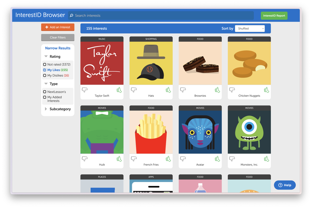
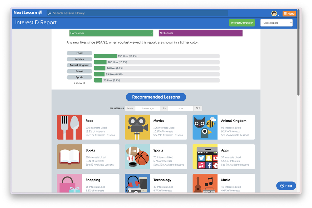
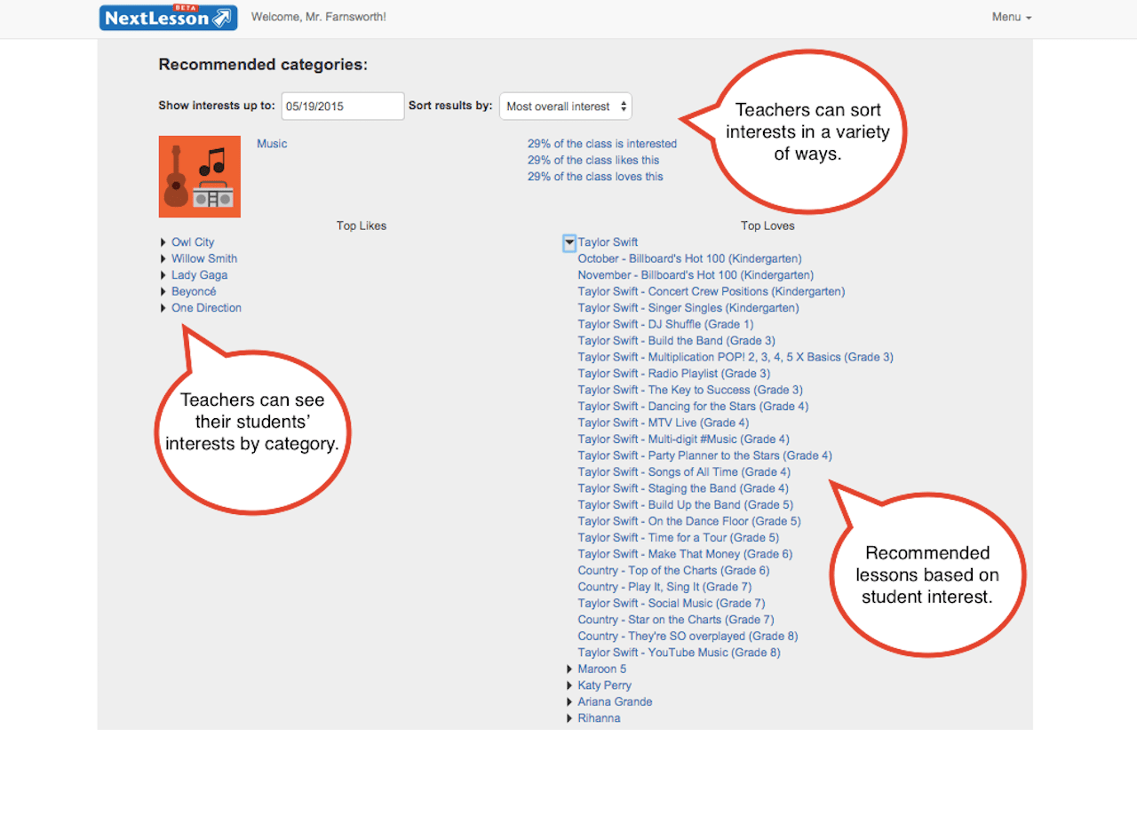
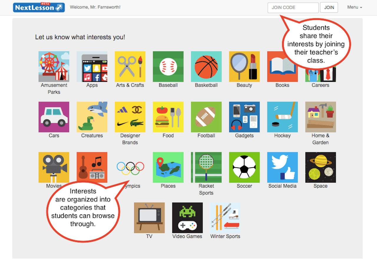
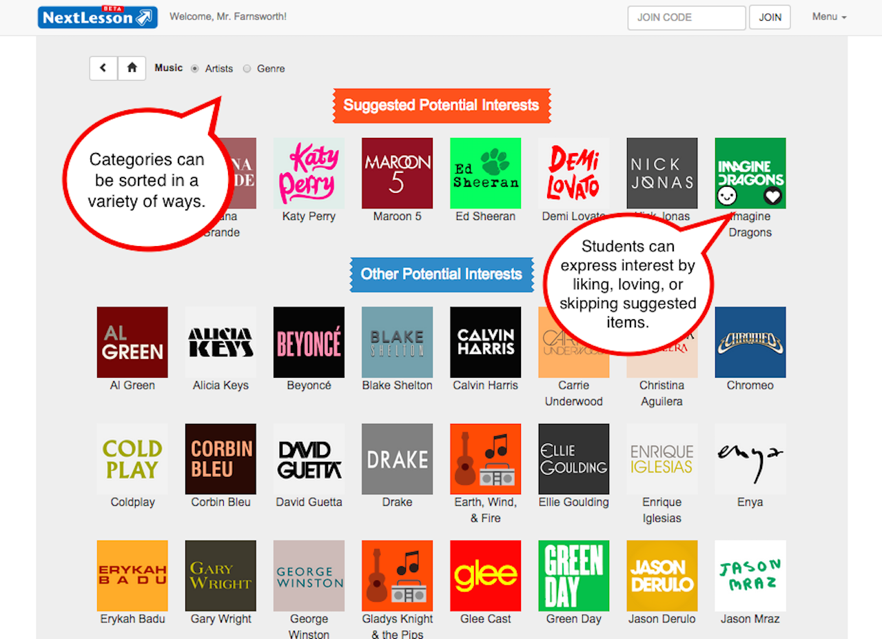
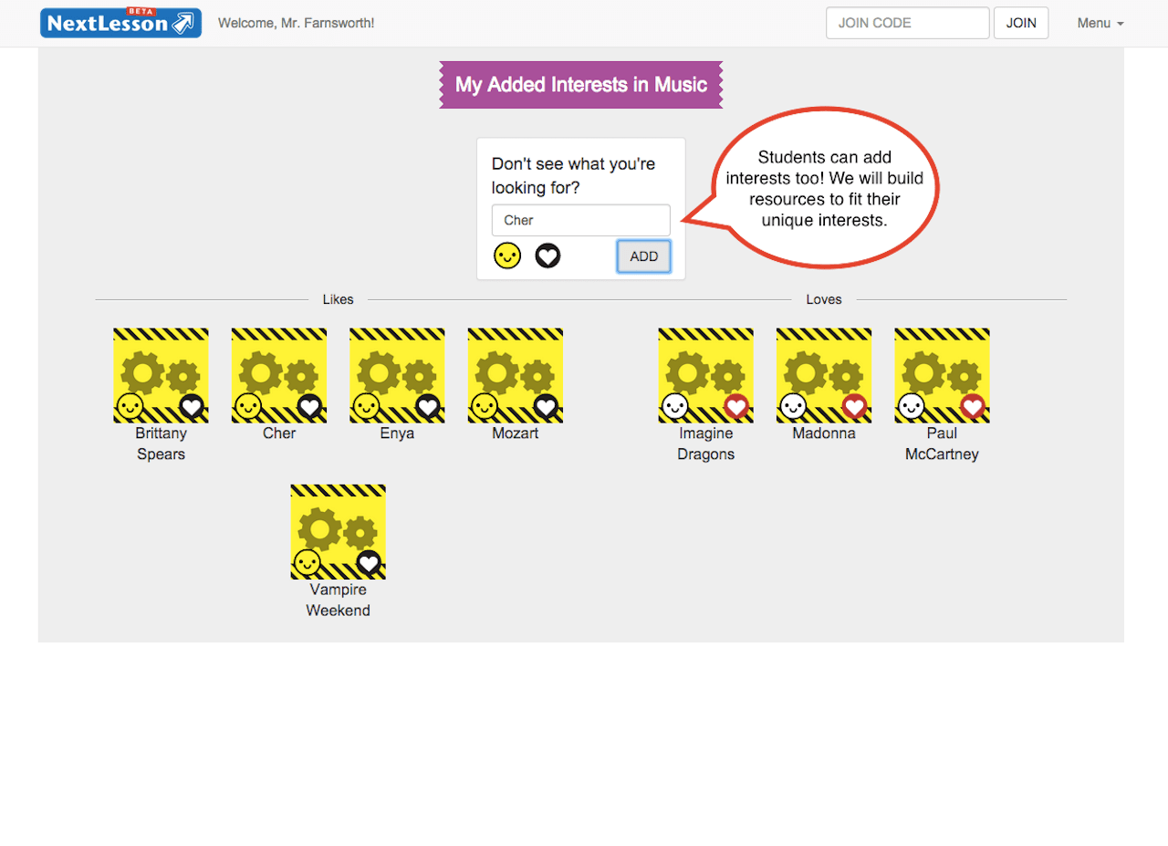
Voting on interests
How Filters worked
Retrospective
Appreciation for current design tools. While I really enjoyed building out prototypes in code, I really appreciate how mature the current crop of design tools are for web and app development. Sure, prototypes benefit from being able to use data files, but it can be a slow process for designers.
First collaborative product building experience. Being part of a team to build a product for teachers and students and seeing how products are built from inception to public testing was a very rewarding experience. I feel like more of a decision maker as it's a vastly different experience compared to marketing an already built prooduct.